- A wordmark or combination mark suits most blogs.
- Build the master in SVG so it stays sharp at any size.
- Test it in the header, a browser tab and a circle.
- WordPress's site icon must be square and at least 512 × 512 px.
- Canva says logos made from its templates can't be trademarked.
Here’s how to design a logo for a blog: decide what the blog stands for and who reads it, choose a logo type (usually a wordmark or a combination of a symbol and the name), pick one or two colours and one readable typeface, sketch several ideas, then build the best one as a vector file and test it at small sizes. Finish by making a square version for your site icon, which WordPress says must be at least 512 × 512 pixels. This guide walks through each step with free tools, checked on 12 October 2026.
Still choosing a name? Start with our guide to Namelix and check it with username availability checkers. Want a ready-made logo in minutes? Our Namecheap Logo Maker review covers one free tool. This page is about designing a logo that works.

How to design a logo for a blog: start with its job
A blog logo has a smaller job than a big company’s, but a demanding one. It has to be readable in your site header on a phone, recognisable as a tiny icon in a browser tab, and clear as a round profile picture on social media. It doesn’t have to explain everything your blog covers. Its main job is to be remembered and recognised, so readers know they’re back on your site.
That’s why simple logos usually work best for blogs. Canva’s logo guide puts it this way: good logos are “simple and recognizable, appropriate and memorable, scalable and timeless and versatile in online and print formats”.
Step 1: Write a one-line brief
Before opening any design tool, write down in one or two sentences what the blog is about, who it’s for and how it should feel. For example: “A calm, practical blog about home espresso for beginners; friendly, not snobbish.” Add three words for the feeling (such as “warm, simple, confident”) and three to avoid (“luxury, technical, loud”). Every later choice, from colour to typeface, should fit the brief. It’s also what you’d hand a designer if you hire one.
Step 2: Choose a logo type

- Wordmark: the blog’s name in a distinctive typeface, as Google and Coca-Cola do. The easiest and often best choice for a new blog, because it teaches readers your name.
- Lettermark: initials, like IBM or HBO. Useful for long names, but the letters mean little until people know the brand.
- Symbol or icon: a picture or abstract shape, like Apple’s apple or Nike’s swoosh. These brands are famous enough to drop the name; a new blog usually isn’t.
- Combination mark: a symbol plus the name. Flexible, because you can use the full version in the header and the symbol alone as the site icon.
- Emblem: the name inside a badge or crest, like Harley-Davidson. Looks traditional, but the small text inside often becomes unreadable at small sizes.
- Mascot: a character, like KFC’s Colonel. Friendly and memorable, but harder to draw well and to shrink.
For most blogs, a wordmark or a combination mark is the practical choice. If you choose a combination mark, design the symbol so it also works alone in a square.
Step 3: Pick colours and a typeface
Choose one main colour and, at most, one accent. Colours carry feeling, but they also have to work in practice: on a white header, on a dark background and in plain black for print or watermarks. A logo that only works in full colour will let you down sooner or later.
For the typeface, pick one that’s easy to read and fits the feeling in your brief. A clean sans-serif reads well at small sizes; a serif can feel classic or editorial; a script can feel personal but often becomes hard to read when small. Two typefaces in one logo is usually the limit. Make sure the font’s licence allows use in a logo; many free fonts do, but check before you commit.
On accessibility, the international web accessibility guidelines (WCAG) say “text that is part of a logo or brand name has no contrast requirement”. Good contrast still helps readers, though, so aim for a logo that’s easy to see against your site’s header.
Step 4: Sketch before you design
Spend twenty minutes with a pen and paper and draw at least ten rough ideas: different layouts of the name, possible symbols, initials, shapes. Sketching is faster than any software, and it stops you from settling on the first template you see. Circle the three strongest ideas, then ask whether each would still be clear the size of a fingernail. Those that pass go into a design tool.
Step 5: Build it as a vector file
Vector graphics are built from shapes rather than pixels, so they stay sharp at any size. MDN explains that SVG vector images “can be rendered at any size without loss of quality”, unlike JPEG or PNG. Free tools that can make a logo:
- Inkscape describes itself as a “powerful, free design tool” for vector imagery, and is free and open-source software licensed under the GPL. It’s a full vector editor and exports SVG and PNG.
- Figma has a free Starter plan with limited access to its products, according to its pricing page. It’s mainly for interface design, but its vector tools work well for simple logos.
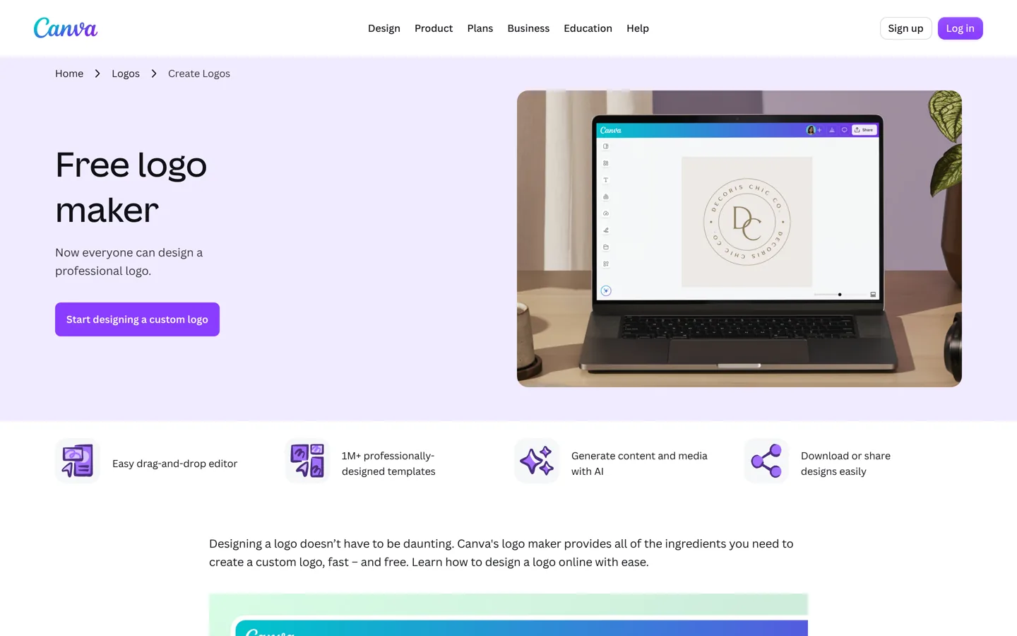
- Canva calls its logo maker free and “made for non-designers”, with drag-and-drop editing and an AI logo generator. Read the trademark rule below before using its templates.
- Brandmark, from the makers of Namelix, creates logos and design assets you edit in the browser, and says it exports SVG, PNG and PDF files.
Canva templates and trademarks: read this first
Canva’s help centre is clear on an important point. Its logo templates “are customizable and can be used by anyone”, which means “your rights to the logo are non-exclusive and you can’t register it as a trademark”. The same applies to stock photos and graphics, because Canva gives only a non-exclusive licence for those. If you want a logo you can register, Canva says you can design one from scratch using simple lines and shapes from its free library and any of its fonts, or upload an original logo you designed yourself or commissioned.
For a hobby blog, a template logo may be perfectly fine. For a blog you plan to turn into a business, design an original logo, or hire someone to, from the start.
Step 6: Test it at every size

- Header: place it in your site header on a phone and on a laptop. Is the name readable without zooming?
- Site icon: shrink it to a square the size of a browser tab icon. If the full logo becomes a smudge, use the symbol or first letter alone.
- Profile picture: put it inside a circle, as most social networks crop profile pictures. Nothing important should sit in the corners.
- One colour: view it in black on white and in white on a dark background.
- Next to similar blogs: place it beside logos from other blogs in your topic. Does yours stand out, or blend in?
Ask a few people from your target readership which version they remember after a minute. If they recall a different detail from the one you intended, simplify.
Step 7: Make your site icon (favicon)
The site icon is the small square image in browser tabs, bookmarks and Google’s search results. WordPress has a built-in Site Icon feature, so you don’t need to create a favicon file by hand. WordPress’s documentation says that since version 6.5 the setting is under Settings → General, and the image “must be square, having a height and width of at least 512 px”, with PNG recommended. In block themes, the Site Logo block also has a Use as site icon option.
Google may show your favicon in search results. Its guidelines say it must be square (1:1) and at least 8 × 8 pixels, recommend making it larger than 48 × 48 pixels, and ask that it be “visually representative of your website’s brand”. Google also says a favicon isn’t guaranteed to appear even when the guidelines are met, and that the favicon’s address should be stable.
Step 8: Add the logo to WordPress
In a block theme, open the Site Editor and edit your header template: the Site Logo block adds your logo, with a slider to set its width, an option to link it to your home page and a Rounded style. WordPress’s documentation notes that unlike a site icon, a logo is only visible on your website’s pages. Classic themes usually have a logo setting under Appearance → Customize → Site Identity. Upload a PNG with a transparent background (or an SVG if your theme supports it) and check the header on a phone afterwards. Our guide to choosing a blog theme covers what to look for in a header.
The files to keep
- The master file in SVG (and your design tool’s own format), so you can edit or resize it later.
- A PNG with a transparent background for your header and documents; Canva’s guide notes that a transparent PNG can sit on different coloured backgrounds without clashing.
- A square icon of at least 512 × 512 pixels for WordPress’s site icon and social profiles.
- Light and dark versions, and a one-colour version for watermarks.
- A one-page style note: your colour codes, typeface names and the minimum size you’ll use the logo at.
Keep these in one folder, backed up, with clear names (“logo-dark-512.png”). Compress the PNGs before uploading, as covered in our guide to compressing images.
Protecting your logo
The USPTO explains that a trademark “can be any word, phrase, symbol, design, or a combination of these things that identifies your goods or services”. Before investing in a logo for a business, search the trademark register for similar names and designs in your field. In the US, the USPTO says you can use “TM” for goods or “SM” for services even if you haven’t filed an application, but the registration symbol ® only with a federally registered trademark, and only for the goods or services listed in the registration. Other countries have their own rules; ask a trademark professional if your blog is becoming a business.
DIY or hire a designer?
Designing it yourself costs time rather than money, and a clean wordmark is well within reach for most bloggers. Hiring a designer makes sense when the blog is becoming a business, when you want an original symbol, or when you’ve tried and the result looks amateur. Give any designer your one-line brief, the three feeling words, examples you like and dislike, and the list of files above, and confirm in writing that you’ll own the final design and its source files.
Common logo mistakes
- Too much detail: thin lines and small text disappear in a browser tab.
- Following a trend that will look dated in two years.
- Too many colours or fonts, which makes the logo hard to reproduce consistently.
- Only a horizontal version, with nothing that fits a square icon or circle.
- Copying a well-known logo too closely, which risks confusion and legal trouble.
- Saving only a small JPEG, so you can’t resize or edit it later.
- Redesigning constantly: readers recognise a logo through repetition, so give it time.
Updating an existing logo
If your blog already has a logo, a refresh is often better than a complete change. Keep what readers already recognise, such as a colour or a shape, and simplify the rest. Update the header, site icon, social profiles and email signature on the same day, and keep the old files in case you need them for older graphics. For the bigger picture of what makes readers trust a blog, see our good-blog checklist.
Questions people ask
What type of logo is best for a blog?
Usually a wordmark (the blog's name in a distinctive typeface) or a combination of a small symbol and the name. Both teach readers your name, and a combination mark gives you a symbol for the site icon.
What size should a blog logo be?
Keep the master as an SVG so it can be any size. For WordPress's site icon, WordPress says the image must be square and at least 512 × 512 pixels, with PNG recommended.
Can I trademark a logo made with a Canva template?
No, according to Canva's help centre: its templates can be used by anyone, so your rights are non-exclusive. It says you can design an original logo from its simple lines, shapes and fonts, or upload your own, to register.
Where do I add a site icon in WordPress?
Since WordPress 6.5, under Settings → General. In block themes, the Site Logo block also has a Use as site icon option.
Will my favicon show in Google search results?
It can. Google says it must be square, at least 8 × 8 pixels (larger than 48 × 48 recommended) and representative of your brand, but it isn't guaranteed to appear.
Can I design a logo for free?
Yes. Inkscape is free and open-source vector software, Figma has a free Starter plan, and Canva's logo maker is free to start.
Sources
- Create a favicon (WordPress documentation) wordpress.org · checked October 12, 2026
- Site Logo block (WordPress documentation) wordpress.org · checked October 12, 2026
- Define a favicon to show in search results (Google) developers.google.com · checked October 12, 2026
- Trademarking logos created on Canva www.canva.com · checked October 12, 2026
- Free logo maker (Canva) www.canva.com · checked October 12, 2026
- What is a trademark? (USPTO) www.uspto.gov · checked October 12, 2026
- SVG: Scalable Vector Graphics (MDN) developer.mozilla.org · checked October 12, 2026
- Understanding SC 1.4.3 Contrast (Minimum) (W3C) www.w3.org · checked October 12, 2026

Building websites since 2006: 500+ web projects of every size and $300K+ in website deals sold or brokered. Founder of A Digital Motive and DigiFlippers. I share the whole process here, plainly.
Founder of A Digital Motive and DigiFlippers