- Chrome device mode and Firefox Responsive Design Mode are free and instant.
- Chrome calls device mode "a first-order approximation"; test on a real phone too.
- PageSpeed Insights combines Lighthouse lab data with real-user field data.
- Google retired the Mobile-Friendly Test on 1 December 2023.
- Check five key pages after every theme or plugin change.
The best free responsive testing tools are already in your browser: Chrome DevTools’ device mode and Firefox’s Responsive Design Mode let you see a page at phone, tablet and desktop sizes in seconds. Add Google’s PageSpeed Insights (powered by Lighthouse) to check mobile performance with real-user data, and finish on a real phone, because, as Chrome’s own documentation says, a simulator is only “a first-order approximation”. Note that Google’s old Mobile-Friendly Test was retired on 1 December 2023. This guide shows how to use each tool, checked on 12 October 2026.
Checking speed in depth? Our guide on Kinsta and Cloudflare performance covers the server side. This page is about how a site looks and works on different screens.

What responsive testing checks
Mozilla’s documentation defines responsive design as designing a website so it looks and works properly on a range of devices, particularly phones and tablets as well as desktops and laptops. Screen size is the obvious factor, but pixel density and touch matter too. When testing, look for:
- text that’s readable without zooming, and no sideways scrolling;
- menus, buttons and links large enough to tap and not too close together;
- images and tables that fit the screen;
- pop-ups and banners that don’t cover the content;
- pages that load quickly and don’t jump as they load.
Free responsive testing tools
1. Chrome DevTools device mode
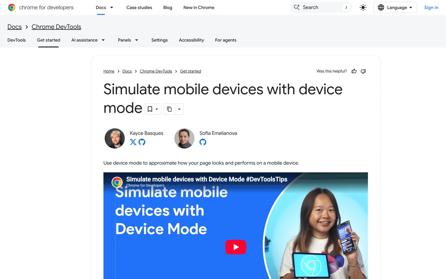
Chrome’s documentation calls device mode a collection of DevTools features that help you simulate mobile devices. To use it:
- Open your page in Chrome, then open DevTools (right-click and choose Inspect).
- Click Toggle device toolbar in the action bar at the top.
- The viewport opens with Dimensions set to Responsive: drag the handles, type a width and height, or choose a specific device from the drop-down.
- Use the width presets bar (Mobile S, Mobile M, Mobile L, Tablet, Laptop, Laptop L, 4K) to jump between common sizes.
- To see where your theme’s layout changes, open More options → Show media queries.
Chrome’s documentation also explains that you can throttle connection speed to see how a page behaves on a slow network.
2. Firefox Responsive Design Mode
Firefox’s documentation says Responsive Design Mode simulates screen size, pixel density and touch. Turn it on from the Browser Tools menu, from the button in the developer toolbox, or with Ctrl + Shift + M (Cmd + Opt + M on macOS). It starts at 320 × 480 pixels; choose a device from the list or edit the width and height, and it remembers your device and orientation between sessions. Testing in a second browser engine also catches layout problems that only show up in one.
3. PageSpeed Insights and Lighthouse
PageSpeed Insights reports on a page’s experience on both mobile and desktop and suggests improvements. Google’s documentation explains it gives two kinds of data:
- Lab data from Lighthouse, collected in a controlled environment and useful for debugging.
- Field data from the Chrome User Experience Report: real users’ Largest Contentful Paint, Interaction to Next Paint, Cumulative Layout Shift and more, shown at the 75th percentile and rated Good, Needs Improvement or Poor.
New or low-traffic pages may not have field data yet; Google notes there must be enough real-user samples first. Run the mobile test on your home page and your most-visited posts.
4. Your own phone (and a friend’s)
Chrome’s documentation is clear that device mode doesn’t actually run your code on a mobile device, and that some things, such as mobile processors, can’t be simulated: “When in doubt, your best bet is to actually run your page on a mobile device.” Open your site on your own phone, and if possible on one other phone with a different operating system. Tap through the menu, a post, a form and your affiliate buttons.
5. Cloud testing on real devices (free trials)
If you need to test on devices you don’t own, cloud services rent them by the minute. BrowserStack, for example, advertises access to 3,500+ real desktop and mobile browser combinations on its Live product and offers a free trial. For most bloggers, two browsers and two real phones are enough; cloud testing earns its cost for client sites or after a redesign.
Run Lighthouse for more than speed
Chrome’s Lighthouse documentation says it has audits for performance, accessibility, SEO and more. Its list includes checks directly tied to responsive design, such as “Optimize viewport for mobile” and “Displays images with incorrect aspect ratio”, plus accessibility checks like whether interactive controls are keyboard-focusable and links have descriptive text. Run it from the Lighthouse panel in Chrome DevTools with the mobile option selected, and work through the failed audits from the top.
Test what people do, not just what they see
- Tap every part of the menu, including sub-menus, and check you can close it again.
- Fill in a form on a phone: does the right keyboard appear for email addresses, and can you see the field while typing?
- Turn the phone sideways: landscape often breaks headers and sticky bars.
- Zoom in to 200% on a computer: text should reflow rather than spill off the screen.
- Try a slow connection with Chrome’s network throttling: does the page still make sense while it loads?
What happened to Google’s Mobile-Friendly Test?
Google retired Search Console’s Mobile Usability report, the Mobile-Friendly Test tool and its API starting on 1 December 2023. Google said this “doesn’t mean that mobile usability isn’t important for success with Google Search”, and pointed to other resources that have emerged, including Lighthouse from Chrome. Many older articles still recommend the Mobile-Friendly Test; use the tools above instead.
Which screen sizes to test
You don’t need every device. Test the widths where layouts usually change: a small phone (Chrome’s Mobile S preset), a large phone (Mobile L), a tablet in portrait, and a typical laptop. If your analytics show readers on a particular device, add it. Media queries in device mode show exactly where your theme switches layout, so test just either side of each breakpoint too, where problems tend to hide.
A 15-minute responsive check

- Pick five pages: home, a long post, a page with a table, your contact form and a page with affiliate buttons.
- Chrome device mode: view each at Mobile S, Mobile L and Tablet widths. Note anything cut off or overlapping.
- Firefox Responsive Design Mode: repeat the two worst pages.
- PageSpeed Insights: run the mobile test on home and your top post; note the Core Web Vitals.
- Real phone: open each page, tap the menu, scroll, submit the form.
- Fix the biggest problem first, then repeat.
Common responsive problems in WordPress, and fixes
- Wide tables cause sideways scrolling: let the table scroll inside its own box, or turn it into a list on small screens.
- Images overflow: make sure images use the theme’s full-width or responsive settings rather than fixed widths.
- Tiny tap targets: increase button padding and space between links in menus and footers.
- Pop-ups cover the page on phones: show them later, make them smaller or turn them off on mobile.
- Text too small: raise the base font size in your theme’s typography settings, and check line spacing too.
- Sticky bars take half the screen: make headers shorter on phones or let them scroll away.
- The page jumps while loading: set image dimensions and reserve space for ads, which helps Cumulative Layout Shift.
If your theme makes these fixes hard, it may be time for a lighter one; our guide on choosing a blog theme covers what to look for.
Images: let WordPress do the resizing
When you upload an image, WordPress creates several smaller copies and adds them to the image’s srcset, so browsers can download a size that fits the screen. Upload images at a sensible size rather than straight from a camera, insert them with the image block rather than as fixed-width HTML, and let the theme handle the rest.
Check the viewport tag
If a page looks like a shrunken desktop site on a phone, check that your theme includes a viewport meta tag in the page’s head, usually <meta name="viewport" content="width=device-width, initial-scale=1">. Almost every modern WordPress theme adds it automatically. You can confirm by viewing the page source and searching for “viewport”.
Keep a simple test log
A short spreadsheet makes responsive testing repeatable: the page, the date, the tool and screen size, what you found, and whether it’s fixed. When a theme update breaks something, the log shows when it last worked and which pages to re-check. It also helps if you hire a developer, because you can hand them a clear list instead of “it looks wrong on my phone”.
Make responsive checks a habit
Test after every theme update, new plugin or design change, and whenever you publish a new kind of page, such as your first comparison table. A quick look in device mode before publishing catches most problems before readers ever see them, and takes less than a minute per page.
For the bigger picture of what makes a site good to read, see our good-blog checklist.
Questions people ask
How do I test if my website is responsive?
Open it in Chrome DevTools' device mode or Firefox's Responsive Design Mode, view it at phone and tablet widths, run PageSpeed Insights on mobile, then check it on a real phone.
Is Google's Mobile-Friendly Test still available?
No. Google retired the Mobile-Friendly Test, its API and Search Console's Mobile Usability report starting 1 December 2023, pointing to resources such as Lighthouse.
How do I open Firefox's Responsive Design Mode?
From the Browser Tools menu, the button in the developer toolbox, or Ctrl + Shift + M (Cmd + Opt + M on macOS).
Is Chrome's device mode accurate?
It's a good approximation of size and touch, but Chrome says it doesn't run your code on a mobile device and can't simulate things like mobile processors, so test on a real phone too.
What does PageSpeed Insights show?
Lab data from Lighthouse for debugging and, when there's enough traffic, field data from real Chrome users for metrics such as LCP, INP and CLS.
Do I need a paid testing service?
Usually not for a blog. Cloud services such as BrowserStack, which offers a free trial, help when you need devices you don't own.
Sources
- Simulate mobile devices with device mode (Chrome for Developers) developer.chrome.com · checked October 12, 2026
- Responsive Design Mode (Firefox Source Docs) firefox-source-docs.mozilla.org · checked October 12, 2026
- About PageSpeed Insights (Google) developers.google.com · checked October 12, 2026
- The role of page experience in creating helpful content (Google Search Central blog) developers.google.com · checked October 12, 2026
- BrowserStack Live www.browserstack.com · checked October 12, 2026
- Lighthouse overview (Chrome for Developers) developer.chrome.com · checked October 12, 2026

Building websites since 2006: 500+ web projects of every size and $300K+ in website deals sold or brokered. Founder of A Digital Motive and DigiFlippers. I share the whole process here, plainly.
Founder of A Digital Motive and DigiFlippers